Hi guys, it’s Kaneo Biggs of @kaneographyy. For this tutorial, I will be walking you through three modern calligraphy styles/fonts and the pen I use to create each one.
The first font is what I call “straight script,” which is my most used style. It comprises of all the basic calligraphy strokes, but with less loops, curls and flourishes. It’s my go-to style because it’s very clean and clear. The second font is “Scriptina,” is from the actual font that I have practiced and love very much. The third is one that everyone who knows and enjoys hand lettering sees the most, the “bouncy lettering.”
Practice Strokes
Before I dive into each style, let’s brush up on the basic strokes and lines needed for you to correctly form your letters. There are eight basic strokes needed to create the letters of the alphabet. Some letters use one or more of the strokes.
The practice strokes are:
Downstroke, which is thick
Upstroke, which is thin
Underturn
Overturn
Compound Curve
Ascending loop
Descending loop
Oval stroke
In addition to the strokes above, there are also a variety of lines including: ascender line, mean line, baseline, and descender line. Now, let’s jump into the 3 different calligraphy fonts.
1. Straight Script
This straight script style is very clean and easy to read. It also helps you to practice forming your letters easily. As a graphic designer, I really like this font. You can clearly see the basic strokes and there are no flourishes or extra decorations.
I normally write this style at a 70-degree angle—it isn’t too vertical or horizontal—which is why I call it the straight script. For this style, I used the Zensations Brush Pen in Super Fine. I must say this is my favorite brush pen of them all. The tip is firm, very fine, easy to control, and the ink is very vibrant. I would recommend this pen for beginners as it helps you with stability on controlling the pen and forming the letters. The Zensations Brush Pen in Super Fine also works well on any texture paper because of its firm tip. If you are writing on a very small paper, it also comes in very handy due to the fine tip size.
2. Scriptina Script
This is my all-time favorite monoline script. It’s monoline because the size of the strokes is one thickness; but there’s a twist to that. I implement a little “faux calligraphy” to it to add some depth to letters.
In the visual of the original word, you will see I added some thickness to the letters, and on the breakdown visual, you see the strokes without the faux calligraphy. This style is great if you want a name or word to stand out. It quickly grabs the eye of the viewer and looks very fancy.
For this font, I used the Zensations Technical Drawing Pen, size 0.2. This is my favorite monoline pen because the pen tip isn’t too fine or too thick—it is just right. All the Zensations Technical Drawing Pens are amazing but the 0.2 has the perfect size for this style. Just like the Zensations Brush Pen, the black ink is very vibrant and has a sturdy tip for easy control. The tip is very stable to help with creating straight lines. With applied pressure, it bends a little but bounces right back once you release the pressure.
3. Bouncy Lettering
The bouncy style lettering is what most modern calligraphers are familiar with. It’s used a lot on home décor items and even in branding for beauty products. This is a very exciting and freehand style. You can truly explore this style and learn to make it your own once you master the basic strokes. So, I would say, practice the first “straight script” style I did and once mastered, you can jump to the “bouncy letters.”
With bouncy lettering, you can somewhat disobey the rules and be creative. It uses a lot of descending loops and the letters streak outside of the x-height. It was hard to decide which Zebra brush pen to use because I could pick any of them and they would work well.
After a little deliberation, I chose the Zensations Brush Pen Double Ended Fine/Medium Point; but I used the fine end. Why did I choose this pen? It is super flexible, but firm enough for easy control. Because of its flexibility, it gives a thicker stroke than the Super Fine version I used for the first style, which is perfect for the bouncy style. You need body and thickness to make this style pop and the pen did just that.
I hope you enjoyed these three modern calligraphy fonts/styles. They are my favorite. For more calligraphy and hand lettering inspiration, check out How to Create Faux Calligraphy in 4 Simple Steps and 4 Things to Know Before Learning Calligraphy.
KANEO BIGGS for ZEBRA PEN
@kaneographyy

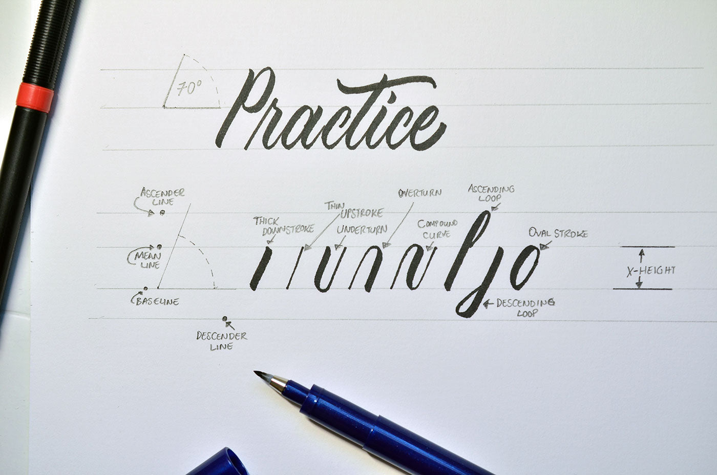

 I normally write this style at a 70-degree angle—it isn’t too vertical or horizontal—which is why I call it the straight script. For this style, I used the Zensations Brush Pen in Super Fine. I must say this is my favorite brush pen of them all. The tip is firm, very fine, easy to control, and the ink is very vibrant. I would recommend this pen for beginners as it helps you with stability on controlling the pen and forming the letters. The Zensations Brush Pen in Super Fine also works well on any texture paper because of its firm tip. If you are writing on a very small paper, it also comes in very handy due to the fine tip size.

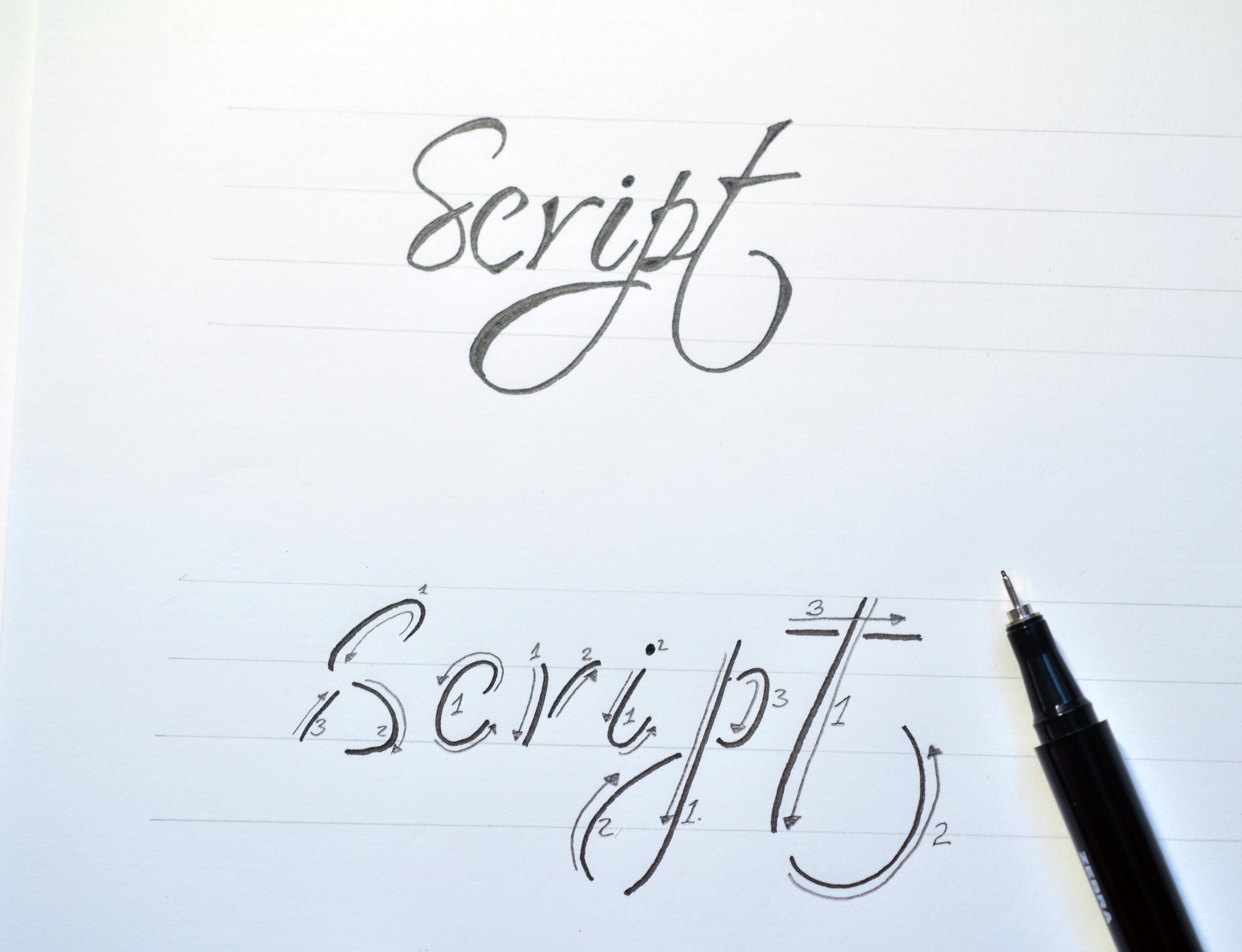 In the visual of the original word, you will see I added some thickness to the letters, and on the breakdown visual, you see the strokes without the faux calligraphy. This style is great if you want a name or word to stand out. It quickly grabs the eye of the viewer and looks very fancy.
 For this font, I used the Zensations Technical Drawing Pen, size 0.2. This is my favorite monoline pen because the pen tip isn’t too fine or too thick—it is just right. All the Zensations Technical Drawing Pens are amazing but the 0.2 has the perfect size for this style. Just like the Zensations Brush Pen, the black ink is very vibrant and has a sturdy tip for easy control. The tip is very stable to help with creating straight lines. With applied pressure, it bends a little but bounces right back once you release the pressure.

 With bouncy lettering, you can somewhat disobey the rules and be creative. It uses a lot of descending loops and the letters streak outside of the x-height. It was hard to decide which Zebra brush pen to use because I could pick any of them and they would work well.
 After a little deliberation, I chose the Zensations Brush Pen Double Ended Fine/Medium Point; but I used the fine end. Why did I choose this pen? It is super flexible, but firm enough for easy control. Because of its flexibility, it gives a thicker stroke than the Super Fine version I used for the first style, which is perfect for the bouncy style. You need body and thickness to make this style pop and the pen did just that.
I hope you enjoyed these three modern calligraphy fonts/styles. They are my favorite. For more calligraphy and hand lettering inspiration, check out How to Create Faux Calligraphy in 4 Simple Steps and 4 Things to Know Before Learning Calligraphy.
KANEO BIGGS for ZEBRA PEN
@kaneographyy
After a little deliberation, I chose the Zensations Brush Pen Double Ended Fine/Medium Point; but I used the fine end. Why did I choose this pen? It is super flexible, but firm enough for easy control. Because of its flexibility, it gives a thicker stroke than the Super Fine version I used for the first style, which is perfect for the bouncy style. You need body and thickness to make this style pop and the pen did just that.
I hope you enjoyed these three modern calligraphy fonts/styles. They are my favorite. For more calligraphy and hand lettering inspiration, check out How to Create Faux Calligraphy in 4 Simple Steps and 4 Things to Know Before Learning Calligraphy.
KANEO BIGGS for ZEBRA PEN
@kaneographyy